Businesses generate enormous amounts of information through customers, operations, marketing, sales, and financial activities. However, raw numbers rarely communicate important patterns clearly without thoughtful organization and visual presentation. This is where modern data visualization becomes valuable for organizations seeking clearer insights from complex information.
Charts, dashboards, graphs, and interactive reports can transform complicated datasets into understandable visual stories. Consequently, decision-makers can identify trends, compare performance, discover unusual patterns, and respond more confidently. The right tools can also reduce the time employees spend interpreting spreadsheets and lengthy reports.
Choosing suitable visualization software depends on business objectives, technical skills, available data sources, and reporting requirements. Some organizations need simple dashboards, while others require advanced analytics, interactive reporting, or customized enterprise solutions. Therefore, businesses should evaluate different options carefully before selecting a platform or professional service.
How Data Visualization Improves Business Decision-Making
Effective data visualization helps businesses convert complicated information into visuals that communicate meaningful insights quickly. Instead of reviewing thousands of spreadsheet rows, managers can examine charts that reveal important performance patterns. This approach allows decision-makers to focus attention on areas requiring immediate investigation.
Interactive dashboards provide additional flexibility because users can filter information according to different requirements. For example, sales managers can compare revenue across regions, products, customer groups, and individual periods. These interactive capabilities make business reporting more useful for both strategic and operational decisions.
Visual reporting can also improve communication between technical teams and business departments. Employees without advanced analytical knowledge may struggle to interpret complex statistical information. Clear charts and dashboards can make important findings easier to understand across different organizational roles.
Furthermore, visual reports can help identify relationships that may remain hidden within traditional spreadsheets. Businesses can compare historical performance, recognize seasonal changes, and identify unexpected variations. These insights can influence marketing strategies, inventory decisions, financial planning, and customer service improvements.
Therefore, organizations should prioritize clarity, accuracy, relevance, and accessibility when designing visual reports. The ultimate goal should remain better understanding rather than visual complexity.
Leading Tools for Modern Data Visualization
Modern data visualization platforms offer different capabilities designed for organizations with varying technical requirements. Some tools prioritize ease of use, while others provide advanced analytics, extensive customization, and enterprise-level integration.
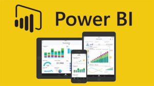
Microsoft Power BI remains widely recognized for its business intelligence and reporting capabilities. It allows users to connect information from numerous sources and create interactive dashboards. Organizations already using Microsoft products may find its integration particularly convenient.
Tableau is another popular platform known for powerful visual analytics and interactive reporting. Its interface allows users to explore information through charts, maps, dashboards, and other visual formats. Tableau can support organizations requiring detailed analysis across multiple departments.
Google Looker Studio provides accessible reporting capabilities for businesses already using Google’s digital ecosystem. It can connect with several information sources and create customizable dashboards. Its collaborative features can make sharing reports across teams relatively straightforward.
Qlik offers analytics solutions designed to help organizations explore relationships within complex information. Its associative approach can help users discover connections that might otherwise remain hidden. Larger organizations may appreciate its broader analytical capabilities.
For organizations requiring advanced customization, programming-based solutions can offer greater flexibility. Python libraries such as Matplotlib, Plotly, and Seaborn allow technical teams to build customized visual reporting experiences. These approaches require stronger technical skills but can support highly specialized analytical requirements.
JavaScript libraries such as D3.js provide another option for organizations needing interactive visual experiences. Developers can create customized charts, maps, animations, and web-based analytical interfaces. This flexibility makes such tools useful when standard dashboard platforms cannot satisfy specific requirements.
Businesses should select tools according to actual requirements rather than choosing platforms based solely upon popularity. A simple dashboard solution may provide better value than an advanced platform for smaller organizations. Conversely, large enterprises may require extensive integrations, governance, security, and customization.
Selecting Professional Data Visualization Services
Professional data visualization services can help businesses transform complicated information into useful dashboards and reports. These services may include data preparation, dashboard development, analytical design, integration, customization, and ongoing support.
Organizations often choose professional assistance when internal teams lack specialized analytical or design expertise. Experienced specialists can evaluate business requirements and recommend suitable visualization approaches. They can also help ensure dashboards communicate information clearly without overwhelming users.
Data preparation represents an important stage because inaccurate or inconsistent information can undermine every resulting report. Professional teams can help identify missing values, duplicate records, inconsistent formats, and other quality concerns. Cleaning information before visualization improves confidence in the resulting insights.
For example, companies evaluating digital audience performance may examine resources from top social media marketing companies while connecting campaign information with broader business reporting. Combining marketing information with visualization dashboards can help decision-makers understand campaign performance and identify opportunities for improvement.
Professional services can also provide ongoing maintenance as business requirements evolve. New information sources, changing metrics, and expanding teams may require dashboards to be updated regularly. Continuous improvement ensures reporting remains relevant instead of becoming outdated.
Best Practices for Effective Data Visualization
Successful data visualization depends heavily upon thoughtful design and accurate interpretation. Businesses should begin by identifying the question each dashboard needs to answer. Starting with a specific objective prevents unnecessary charts from overwhelming users.
Chart selection should also match the type of information being communicated. Line charts can demonstrate changes over time, while bar charts can compare categories effectively. Maps may help explain geographic patterns when location represents an important analytical factor.
Organizations should avoid using excessive colors, decorative graphics, or unnecessary visual elements. A clean design allows important information to receive greater attention. Consistent formatting also makes dashboards easier to understand across different reporting periods.
Labels should remain clear and descriptive so users understand exactly what each measurement represents. Ambiguous terminology can create confusion even when the underlying information remains accurate.
Dashboards should also prioritize the most important metrics rather than displaying every available measurement. Too much information can reduce decision-making efficiency by forcing users to search through unnecessary details.
Interactive functionality can improve usability when implemented thoughtfully. Filters, drill-down features, tooltips, and selectable periods can help users investigate specific areas. However, excessive interactivity may make dashboards difficult for inexperienced users.
Finally, businesses should review dashboards regularly to ensure displayed metrics still support current objectives. Business priorities change, meaning old measurements may eventually lose their usefulness. Periodic reviews help organizations maintain relevant and effective reporting systems.
Building Long-Term Value Through Data Visualization
The long-term value of data visualization comes from helping organizations develop stronger relationships with their information. When employees understand performance clearly, they can make decisions based on evidence rather than assumptions.
Organizations should treat dashboards as evolving business tools rather than static reporting documents. As markets change and business strategies develop, reporting requirements will also change. Regular improvements can keep dashboards aligned with current organizational priorities.
Training is another important part of successful implementation. Employees need to understand how dashboards work and how displayed information should influence decisions. Without proper training, even sophisticated reporting platforms may remain underused.
By combining accurate information, thoughtful design, appropriate technology, and effective employee training, organizations can create lasting analytical value. This approach enables decision-makers to recognize opportunities, respond to challenges, and improve performance with greater confidence.